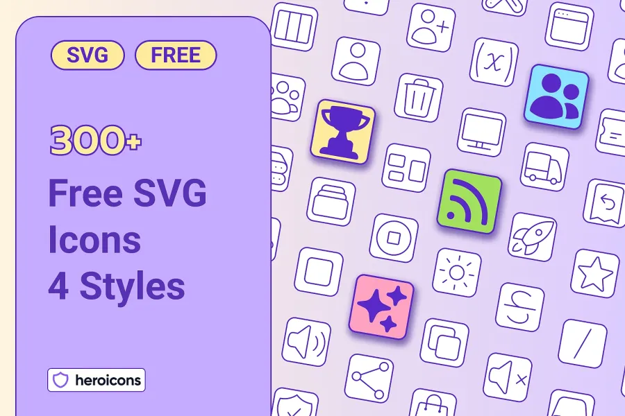
Heroicons: SVG Icons by the Tailwind CSS Team, in 4 Styles
300+ Free Heroicons Commercial-Use SVG Icons in Four Styles
 Edit
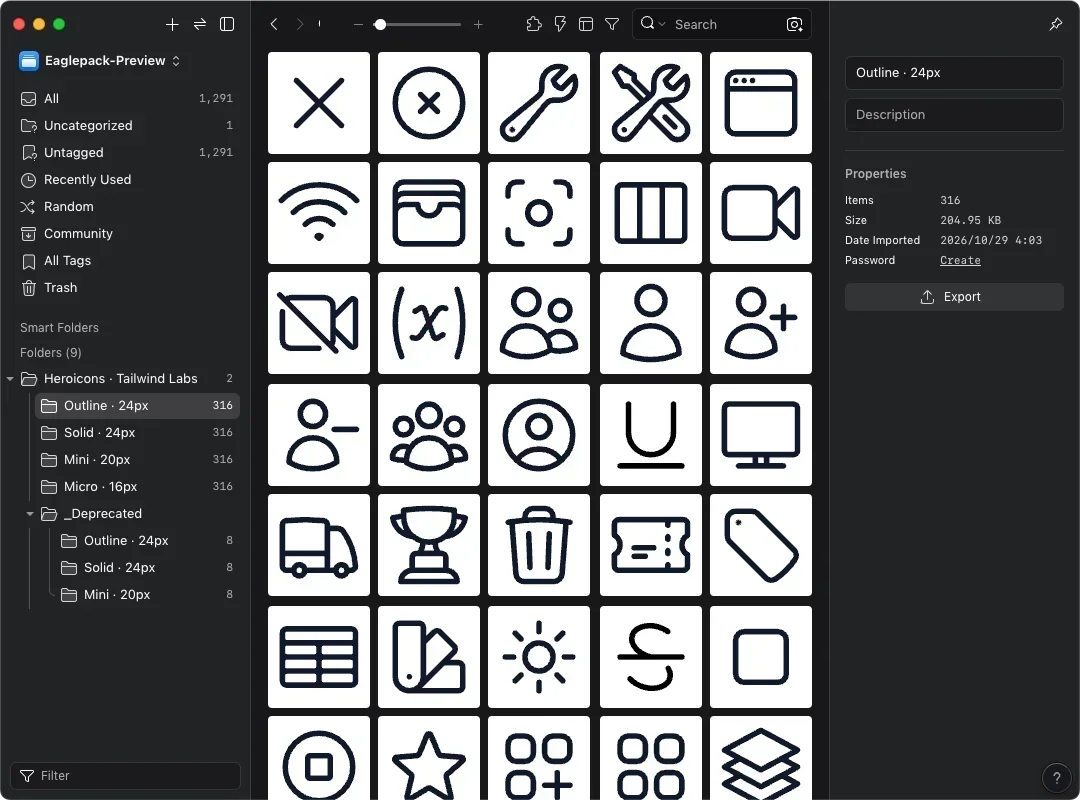
All 316 Heroicons in Outline, Solid, Mini, and Micro, sorted into folders by style. SVG, MIT-licensed, free for commercial use.

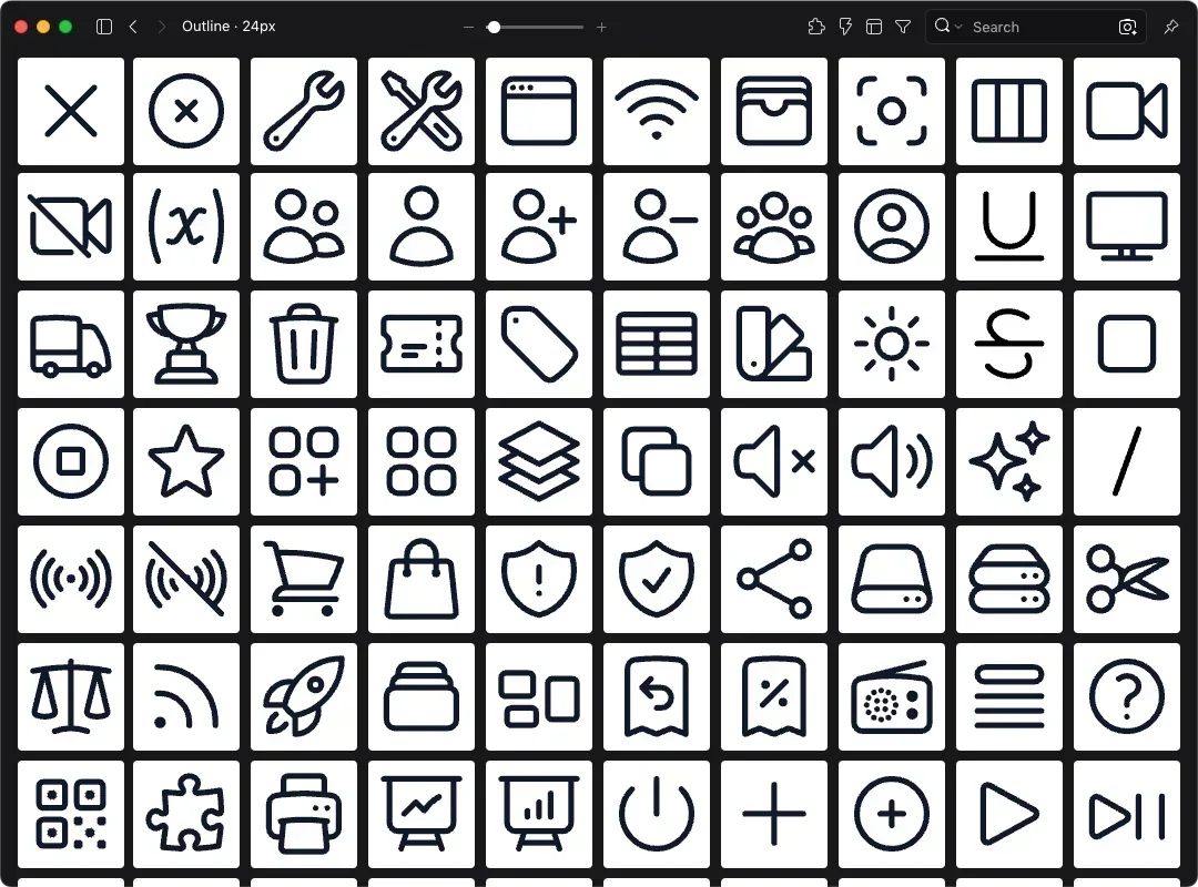
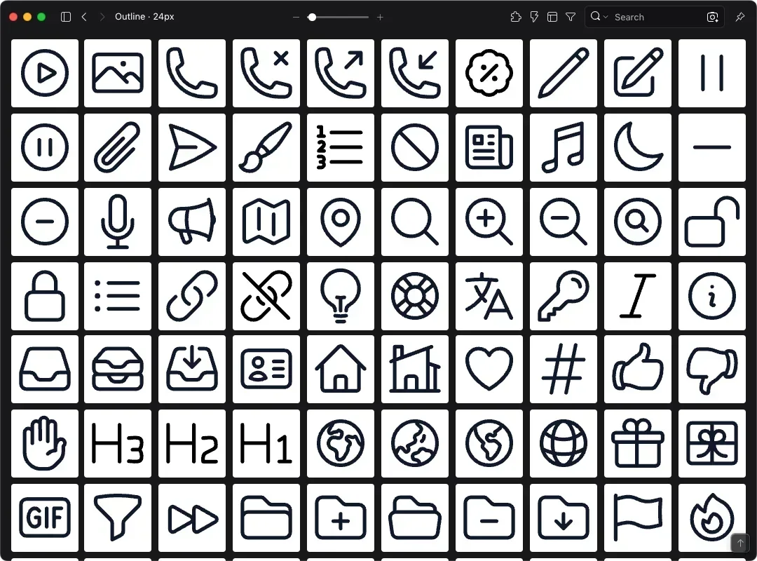
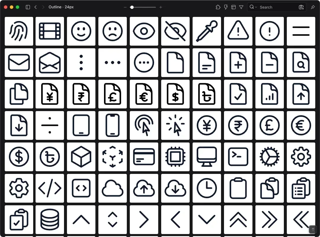
This eaglepack brings together all 316 Heroicons, each in four styles: Outline, Solid, Mini, and Micro. They're sorted into one folder per style, so you can import the pack into Eagle and start picking icons right away. Heroicons is made by the team behind Tailwind CSS and released under the MIT license, which means it's free for commercial projects. Outline icons are drawn on a 24×24 grid with a 1.5px stroke. The other three styles are filled, at 24px, 20px, and 16px.
In an interface, the same icon tends to show up at several sizes: 24px in the navigation, 20px inside a button, 16px in a table or tag. Scale a large icon down and its lines start to blur together. Heroicons ships a separate set for each of these sizes with identical names, so switching sizes is just a matter of grabbing the icon with the same name.
Heroicons comes from Tailwind Labs, best known for Tailwind CSS, a styling framework front-end developers use to build web pages. Tailwind CSS has close to 100,000 stars on GitHub. Most of the icons were drawn by designer Steve Schoger, who co-wrote the interface design book Refactoring UI with Tailwind CSS creator Adam Wathan. Heroicons itself has about 24,000 GitHub stars, plus official React and Vue packages and a Figma file.
Key Features
- Every icon comes in Outline 24, Solid 24, Mini 20, and Micro 16
- Outline icons share a 24×24 canvas and 1.5px stroke
- Icon names match the React and Vue packages, so designs map straight to code
- Organized into one folder per style, so you never sort sizes by hand
Can You Use Heroicons in Commercial Projects?
Yes. Heroicons is MIT-licensed, so you can use and modify the icons in personal and commercial work for free. You don't need on-screen credit when they appear in your designs, websites, or apps. If you redistribute the icon files themselves, for example as part of another asset pack, include the original MIT license notice.
Specs and How the eaglepack Is Organized
All icons are SVG files you can drop straight into Figma, Illustrator, or Sketch. The eaglepack contains these folders:
- Outline · 24px (316 icons)
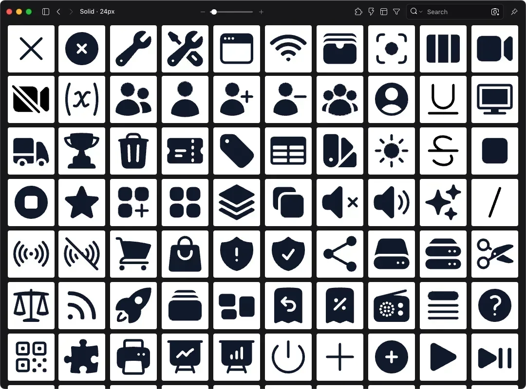
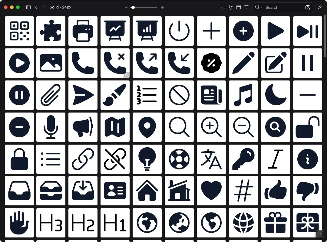
- Solid · 24px (316 icons)
- Mini · 20px (316 icons)
- Micro · 16px (316 icons)
A separate _Deprecated folder holds 8 icons that were removed from heroicons.com but still ship in the package for backward compatibility (such as arrow-small-up and plus-small), in Outline, Solid, and Mini. They're handy if you maintain an older project. For new work, you can skip this folder.
Where Do Heroicons Work Best?
Outline and Solid 24px fit navigation spots like an app's tab bar or a dashboard sidebar, and the two styles pair naturally as unselected and selected states. Mini 20px sits comfortably inside buttons and input fields. Micro 16px suits dense layouts like tables, badges, and dropdown menus.
If you work with developers who use Tailwind CSS, Heroicons also cuts down on handoff back-and-forth. Whatever icon you use in the design, they can pull the same name from @heroicons/react or @heroicons/vue without you exporting any SVGs. That saves real time on fast-moving projects like SaaS dashboards and internal tools.
You may also like