【Web Design Inspiration Picks】200+ "Customer Case Studies & Changelog" UI/UX References
【Web Design Inspiration Picks】200+ Examples of "Case study & Changelog" page design
Over 200 curated web design examples, enhancing appeal through customer case studies and regularly updated changelogs to reinforce brand commitment.


Curating Over 10,000 Web Designs to Extract the Most Essential Inspirational Examples ✨
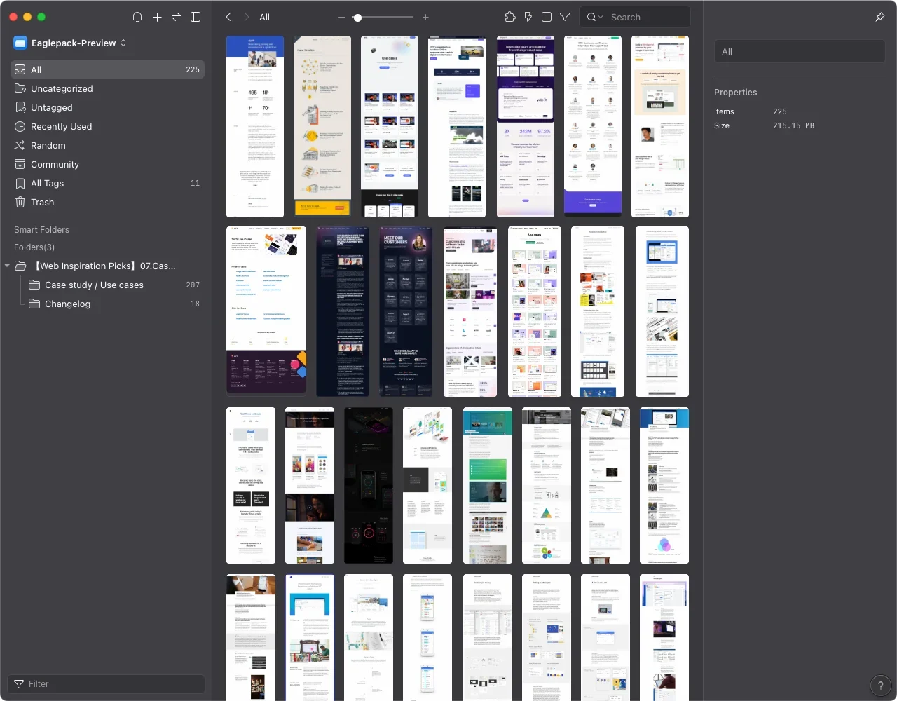
Welcome to the sixth installment of our web design inspiration series! Although the next task involves organizing an overwhelming number of landing pages, which tempts me to give up, we’ve made it halfway through the submissions, so there’s no turning back now! This collection is sourced from prominent sites like Lapa Ninja, Land-book, and Landingfolio. As with our previous posts, the tags and primary color themes are pre-categorized for your convenience. I hope you enjoy it, and let’s keep pushing forward together! 🙆🏻♀️
【Web Design Inspiration Picks】After initial planning and organization, I anticipate a series of 10 posts featuring different page themes. Six of these posts have already been submitted and approved. If you want to save these, you can click on the article titles below to download them!👇🏻
1.【Web Inspiration Picks】700+ Examples of "About" Page Designs
2.【Web Inspiration Picks】600+ Examples of "Product" Page Designs
3.【Web Inspiration Picks】800+ Examples of "Pricing" Page Design
4.【Web Inspiration Picks】400+ Examples of "Customers & Showcase" Page Design
5.【Web Inspiration Picks】500+ Example of "News, Blog & Careers" Page Design
6.【Web Inspiration Picks】100+ Examples of "Affiliates" Page Design
Captivating Customer Cases: Enhancing Team and Brand Credibility
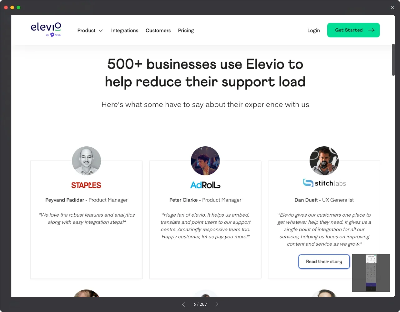
Typically, the primary purpose of showcasing customer cases or case studies is to enhance trust and professionalism for your team and brand. Therefore, special attention must be given to the “attractiveness” of these pages to leave a positive impression on site visitors. Here are 3+1 tips to help you create a visually appealing and attention-grabbing website design:
Clear Navigation Structure:
Ensure visitors can easily find the customer case section. Consider categorizing cases by industry, solution, or product type.Eye-catching Case Thumbnails:
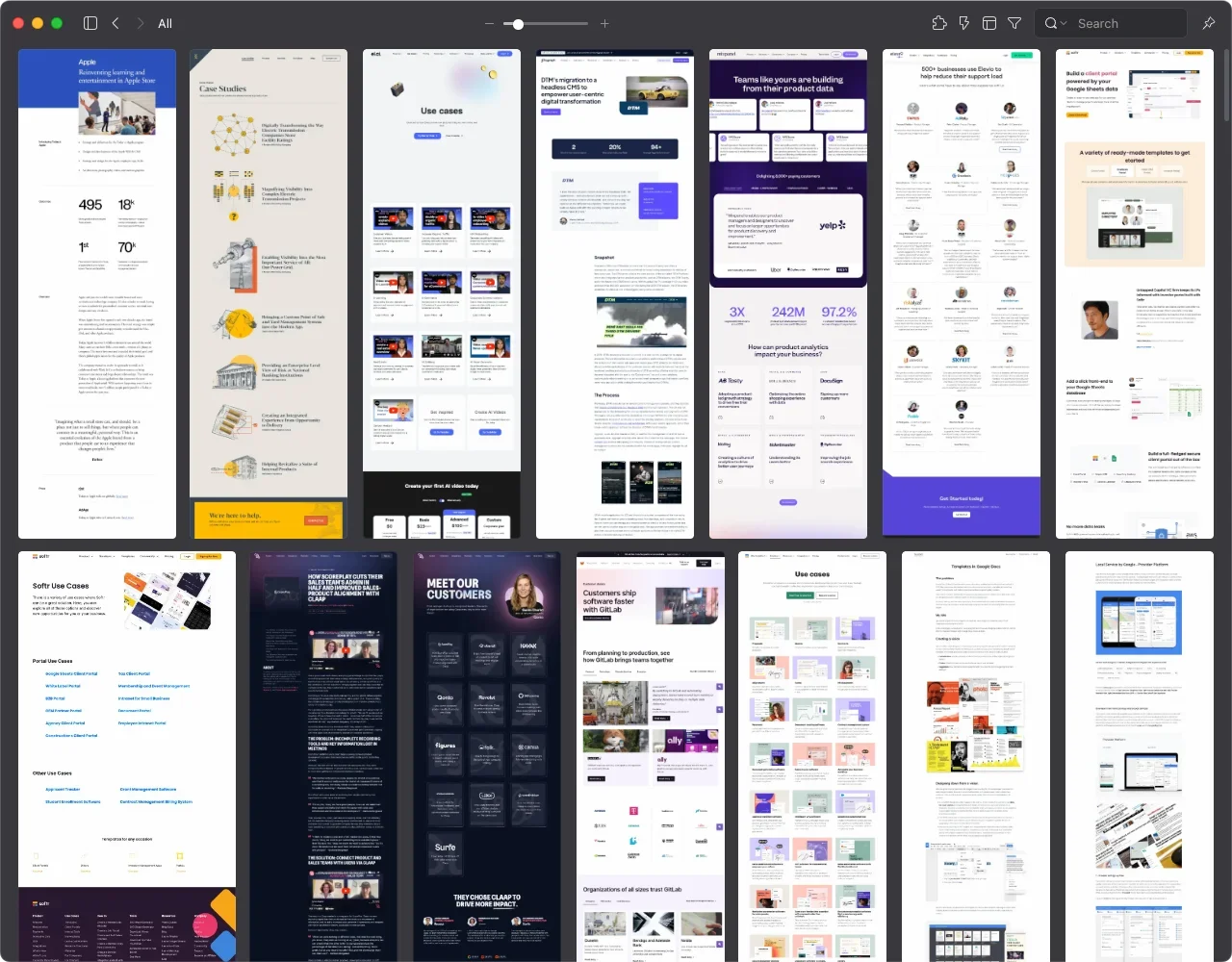
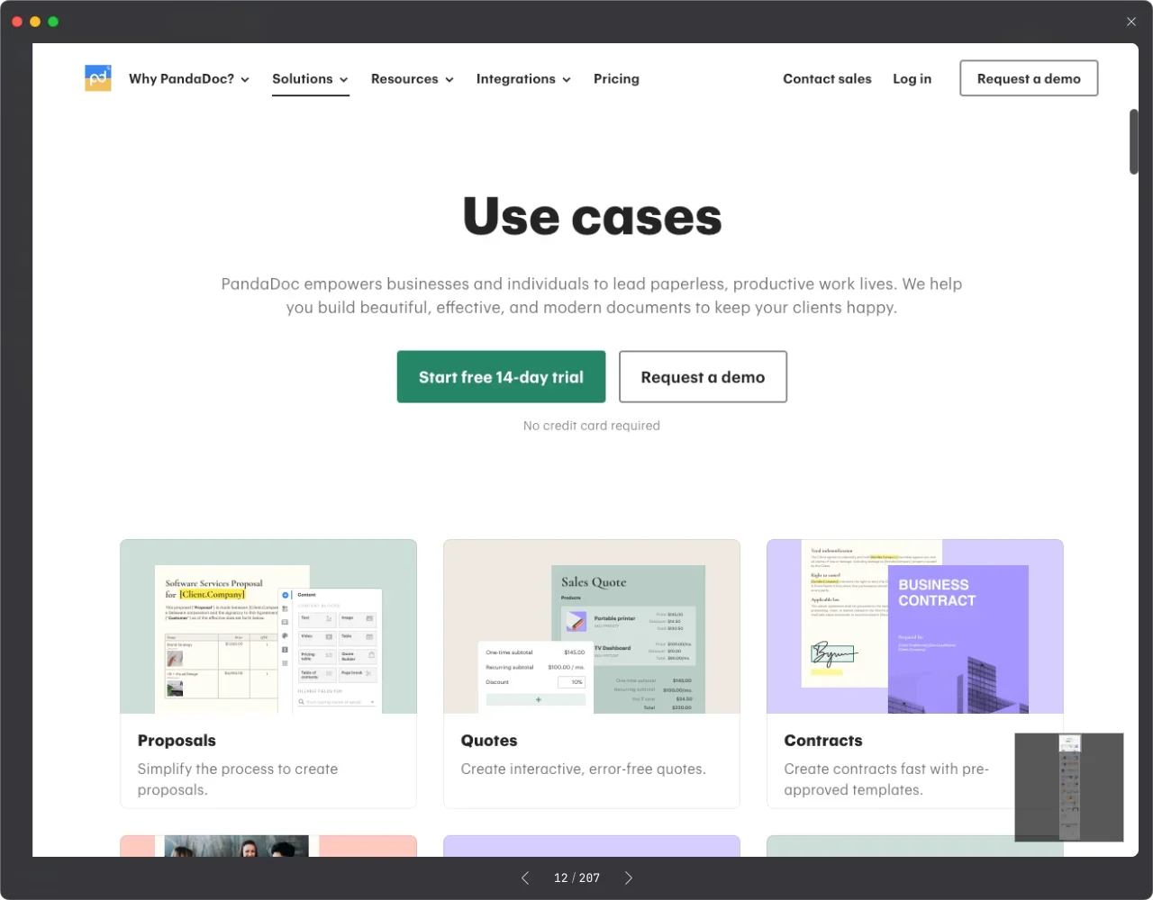
Use compelling thumbnails or images to attract visitors' attention, such as brand logos or high-quality product photography. These thumbnails should be clear, attractive, and highlight the key points of each case.Clear Case Descriptions:
Each case should have a clear and specific description, including the client’s challenges, the solutions provided, and the outcomes. These descriptions should be easy to understand and emphasize the client’s success story.Support with Multimedia Content:
If resources allow, consider including multimedia content such as images, videos, or customer testimonials in the case studies. These elements can make the cases more vivid and persuasive, increasing visitor interest and engagement.
Building a Transparent Changelog: Structure, Updates, and Sharing
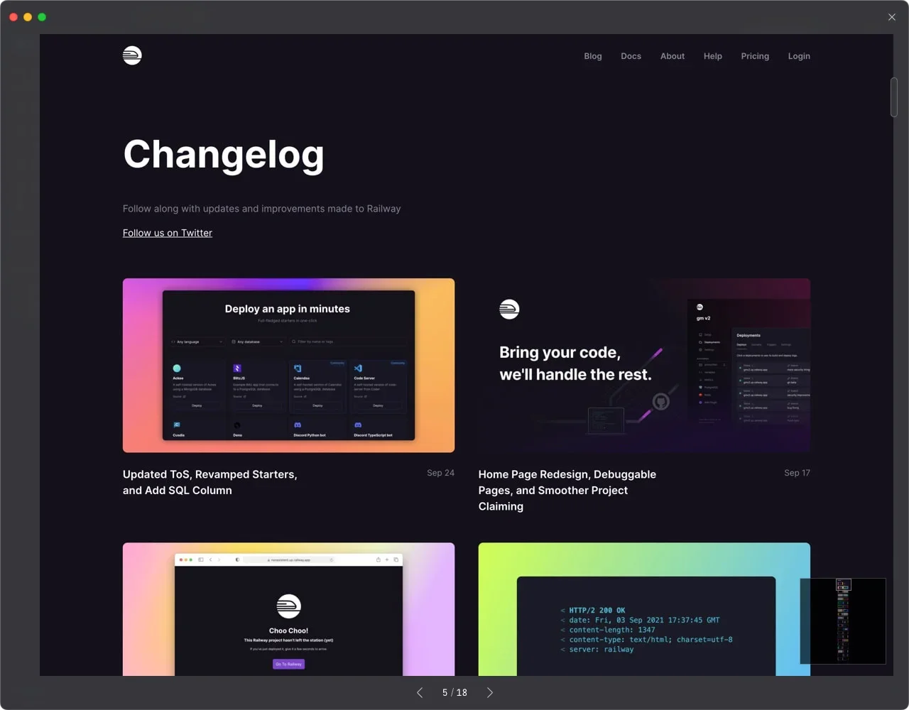
While most changelogs on the web primarily use text with images, you can enhance your product content with multimedia, including videos and 3D simulations. If you want the changelog to be a space for interaction with peers or users, consider adding a comment section. However, this is generally not recommended to avoid disrupting customer service or business workflows. 😉
Structure and Categorization:
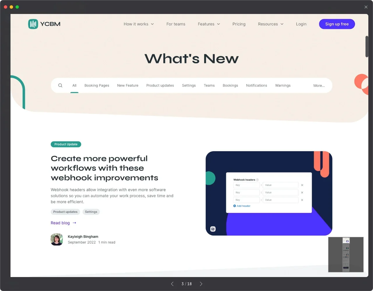
Divide the changelog into different categories or themes, such as feature updates, bug fixes, and technical challenges, so visitors can easily find the content they’re interested in.Timely Updates:
Regularly update the changelog to keep users informed about the latest development progress and product updates. This helps build transparency and shows users the company’s commitment to the product.Sharing Technical Challenges and Solutions:
If you encounter technical challenges during development, share these challenges and their solutions in the changelog. This not only adds value but also demonstrates your problem-solving capabilities.
By focusing on these key elements, you can enhance user experience and page appeal, making your brand more trustworthy.
